The 2024 Living Planet Index reports a 73% average decline in wildlife populations — what’s changed since the last report?
A guide to understanding the Living Planet Index and what it does and doesn’t mean.
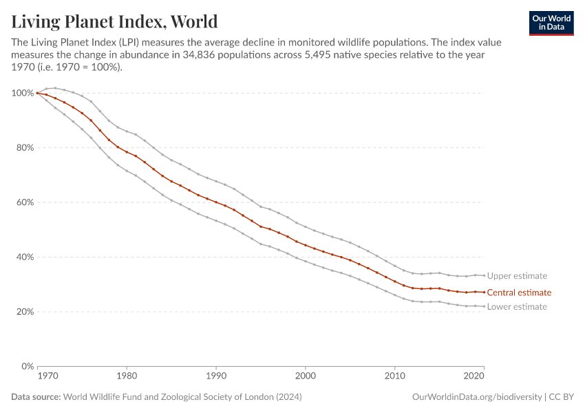
The 2024 Living Planet Index report is published today and makes for some grim reading.1 The headline is a 73% average decline in wildlife populations since 1970.
While these trends are extremely worrying, the numbers presented in the Living Planet Index (LPI) report are often misunderstood or misreported. In this article, we give a short overview of what these numbers mean — and don’t mean — and what some of the data underneath the headline figure shows.
We’ve written about the LPI several times before, including more technical texts that explain how it should be interpreted, so we’ll link to those when we can if you want to dig deeper.
The headline figure from the 2024 update of the LPI is that studied wildlife populations have seen an average decline of 73% from 1970 through 2020. You can see this decline in the chart below.
First, let’s clarify what this doesn’t mean. It doesn’t tell us anything about:
- The number of species lost
- The number of populations or individuals that have been lost
- The number or percentage of species or populations that are declining
- The number of extinctions
Any headlines claiming that we’ve “lost 73% of wildlife”, “73% of species have gone extinct” or “73% of species are declining” are incorrect.
What this metric tells us is that across the 34,836 studied wildlife populations, the average decline was 73%. As we’ll see later, this doesn’t mean 73% of populations are in decline; in fact, around half of the studied populations were in decline, while half were either increasing or stable.
How the Living Planet Index (LPI) is calculated
We go into how the LPI is calculated in a dedicated article.
But as a summary: researchers collect data on the change in wildlife numbers across tens of thousands of populations. While the data is measured relative to 1970, very few populations have data stretching back this far. Many populations only have data for much shorter and sparser timelines.
For every population, the change in numbers over time is calculated, giving a rate of change. It can be positive, negative, or zero.
To get the final LPI number, researchers take the geometric mean of the rate of change across all of these populations.
What’s changed since the last Living Planet Index Report?
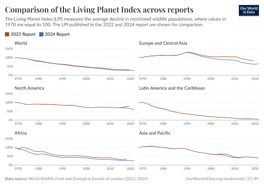
The 2022 Living Planet Index reported an average decline of 69% since 1970. This 2024 update reports a 73% decline.
From this, you might assume that wildlife populations have dropped by another 4 percentage points in the additional two years of data.
However, almost none of this change has happened in the last few years, and the new LPI should not be seen as a simple extension of the previous one.
Instead, the whole trend line for the LPI has shifted as the project has access to data for more populations and species, and the type of populations that are included has changed. The number of populations in the LPI increased by around 3,000 (just short of a 10% rise), and the number of species increased by around 250 (a 5% rise).
The other major change is that only native species are included in this update, whereas native and non-native species were included in previous reports. This explains a lot of the difference in this year’s report. In the technical supplement, the authors compare what this year’s LPI looks like with and without non-native species. When non-native species are included, the LPI trend is closer to previous reports.
The chart below compares the LPI in 2022 and 2024 globally and for different regions. You can see that the whole lines have shifted, rather than the decline accelerating in the two most recent years.
The biggest shifts in this report, compared to the last, are for Europe and Central Asia; and Africa, where the reductions are more substantial in the most recent update.
The reason for the change in Africa is a 45% increase in the number of populations included, many of which are declining. This has caused the LPI for this region to shift down.
The exclusion of non-native species from the LPI has meant there are fewer populations counted in Europe and Central Asia, and this has been the main reason for the change in the trend in this region.
Around half of the studied populations are decreasing; the rest are increasing or stable
When you hear an average decline of 73%, you’d probably imagine that most of the world’s studied wildlife populations are in decline.
But when we look at how many populations that are increasing, stable, or decreasing, this isn’t the case. Almost as many populations are increasing as decreasing.
Across the whole dataset, exactly 50% of populations were in decline; 43% were increasing; and the remaining 7% were stable.2
In the chart, we can see the share of populations in LPI that have trended in a given direction for different taxonomic groups. What you’ll notice is that “only” around half of wildlife populations declined in numbers. The rest were either increasing or stable.
So, not all populations are struggling. This is not to dismiss the steep decline many populations are seeing. Instead, it’s useful to know so that we can direct resources more efficiently to those areas and populations that need it most. It’s more effective to target restorative and protection efforts to the populations that are in serious trouble than to assume that all populations are struggling.
If some populations are doing well and others very poorly, we want to know so that we can understand why and work out how to stop it.
Direct exploitation and habitat loss are still the biggest threats to biodiversity
Estimates of the magnitude of population decline are updated with every Living Planet Index report, but the main drivers of biodiversity loss remain the same.
Direct pressures — including deforestation, habitat loss, hunting, overfishing, and other environmental impacts of food production — are the biggest causes.3
Climate change is also impacting biodiversity. For example, species are shifting towards the poles and to higher elevations to track suitable climates. While the impacts of climate change on biodiversity are currently less substantial than the direct pressures listed above, they are expected to intensify as global temperatures rise.
What we need to do to slow biodiversity loss is clear. Reduce the amount of land we use for agriculture. Bring deforestation to an end. Use fertilizers and agricultural inputs more efficiently (to have high productivity but low levels of excess nutrients and pollution). Reduce levels of overfishing. Protect areas of high species richness and areas with unique biodiversity.
When combined with restoration and reintroduction programs, it’s not only possible to slow down biodiversity loss: we can also bring species back from the brink. We’ve seen this for species such as the European bison, Eurasian beaver, and wolves across Europe.
Many of the world’s wildlife populations are struggling, but we have solutions to turn things around.
Explore more of our articles on the Living Planet Index:
Living Planet Index: what does it really mean?
The Living Planet Index is the biodiversity metric that always claims the headlines. It’s often misinterpreted. How should we understand it?
FAQs on the Living Planet Index
The Living Planet Index is one of the most common measures used in biodiversity monitoring. But what is it, and where does this data come from?
How does the Living Planet Index vary by region?
The Living Planet Index shows an average decline of 73% across studied animal populations globally. But how does this vary by region?
How the Living Planet project helps us understand changes in the world’s wildlife
Beneath the popular index, the Living Planet database helps us understand where and what animals are deeply threatened, and what animals are thriving.
Endnotes
WWF (2024) Living Planet Report 2024 – A System in Peril. WWF, Gland, Switzerland.
Deinet S, Marconi V, Freeman R, Puleston H, McRae L. Living Planet Report 2024 Technical Supplement: Living Planet Index. ZSL, 2024.
Maxwell, S. L., Fuller, R. A., Brooks, T. M., & Watson, J. E. (2016). Biodiversity: The ravages of guns, nets and bulldozers. Nature.
Cite this work
Our articles and data visualizations rely on work from many different people and organizations. When citing this article, please also cite the underlying data sources. This article can be cited as:
Hannah Ritchie and Fiona Spooner (2024) - “The 2024 Living Planet Index reports a 73% average decline in wildlife populations — what’s changed since the last report?” Published online at OurWorldinData.org. Retrieved from: 'https://ourworldindata.org/2024-living-planet-index' [Online Resource]BibTeX citation
@article{owid-2024-living-planet-index,
    author = {Hannah Ritchie and Fiona Spooner},
    title = {The 2024 Living Planet Index reports a 73% average decline in wildlife populations — what’s changed since the last report?},
    journal = {Our World in Data},
    year = {2024},
    note = {https://ourworldindata.org/2024-living-planet-index}
}
Reuse this work freely
All visualizations, data, and code produced by Our World in Data are completely open access under the Creative Commons BY license. You have the permission to use, distribute, and reproduce these in any medium, provided the source and authors are credited.
The data produced by third parties and made available by Our World in Data is subject to the license terms from the original third-party authors. We will always indicate the original source of the data in our documentation, so you should always check the license of any such third-party data before use and redistribution.
All of our charts can be embedded in any site.

