Where in the world do people have the highest CO2 emissions from flying?
Globally, aviation accounts for around 2.5% of CO₂ emissions. But for many, it accounts for a much larger share.
Aviation accounts for around 2.5% of global carbon dioxide (CO2) emissions. But if you are someone who does fly, air travel will make up a much larger share of your personal carbon footprint.
The fact that aviation is relatively small for global emissions as a whole, but of large importance for individuals that fly is due to large inequalities in the world. Most people in the world do not take flights. There is no reliable global figure, but often cited estimates suggest that more than 80% of the global population have never flown.1
How do emissions from aviation vary across the world? Where do people have the highest footprint from flying?
Per capita emissions from domestic flights
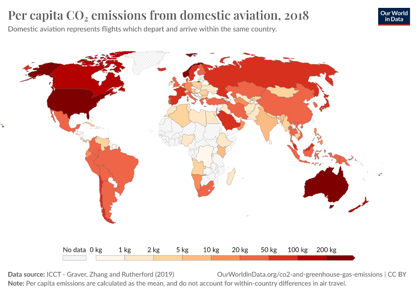
The first and most straightforward comparison is to look at emissions from domestic aviation – that is, flights that depart and arrive in the same country.
This is easiest to compare because domestic aviation is counted in each country’s inventory of greenhouse gas emissions. International flights, on the other hand, are not attributed to specific countries – partly because of contention as to who should take responsibility (should it be the country of departure or arrival? What about layover flights?).
In the chart here we see the average per capita emissions from domestic flights in 2018. This data is sourced from the International Council on Clean Transportation – we then used UN population estimates to calculate per capita figures.2
We see large differences in emissions from domestic flights across the world. In the United States, the average person emits around 386 kilograms of CO2 each year from internal flights. This is followed by Australia (267 kg); Norway (209 kg); New Zealand (174 kg); and Canada (168 kg). Compare this with countries at the bottom of the table – many across Africa, Asia, and Eastern Europe in particular emit less than one kilogram per person – just 0.8 kilograms; or 0.14 kilograms in Rwanda. For very small countries where there are no internal commercial flights, domestic emissions are of course, zero.
There are some obvious factors that explain some of these cross-country differences. Firstly, countries that are richer are more likely to have higher emissions because people can afford to fly. Second, countries that have a larger land mass may have more internal flights – and indeed we see a correlation between land area and domestic flight emissions; in small countries, people are more likely to travel by other means such as car or train. And third, countries that are more geographically-isolated – such as Australia and New Zealand – may have more internal travel.
Related charts:
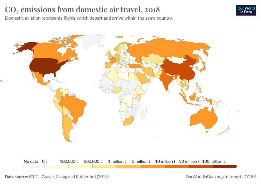
Total CO₂ emissions from domestic aviation
See the data in our interactive visualization
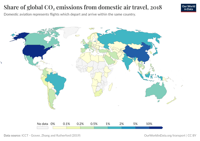
Share of global CO₂ emissions from domestic aviation
See the data in our interactive visualization
Per capita emissions from international flights
Allocating emissions from international flights is more complex. International databases report these emissions separately as a category termed ‘bunker fuels.’ The term ‘bunker fuel’ is used to describe emissions which come from international transport – either aviation or shipping.
Because they are not counted towards any particular country these emissions are also not taken into account in the goals that are set by countries in international treaties like the Kyoto Protocol or the Paris Agreement.3
But if we wanted to allocate them to a particular country, how would we do it? Who do emissions from international flights belong to: the country that owns the airline; the country of departure; the country of arrival?
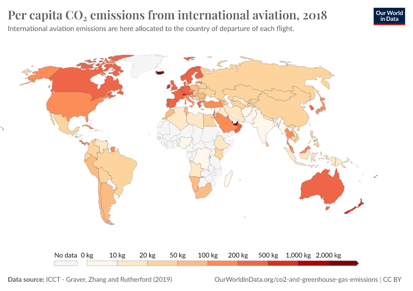
Let’s first take a look at how emissions would compare if we allocated them to the country of departure. This means, for example, that emissions from any flight that departs from Spain are counted towards Spain’s total. In the chart here we see international aviation emissions in per capita terms.
Some of the largest emitters per person in 2018 were Iceland (3.5 tonnes of CO2 per person); Qatar (2.5 tonnes); United Arab Emirates (2.2 tonnes); Singapore (1.7 tonnes); and Malta (992 kilograms).
Again, we see large inequalities in emissions across the world – in many lower-income countries per capita emissions are only a few kilograms: 6 kilograms in India, 4 kilograms in Nigeria; and only 1.4 kilograms in the Democratic Republic of Congo.
Related charts:
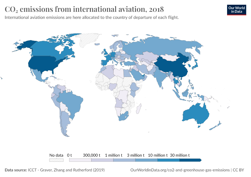
Total CO₂ emissions from international aviation
See the data in our interactive visualization
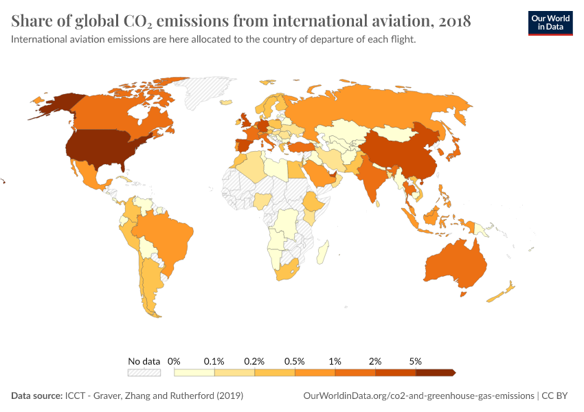
Share of global CO₂ emissions from international aviation
See the data in our interactive visualization
Per capita emissions from international flights – adjusted for tourism
The above allocation of international aviation emissions to the country of departure raises some issues. It is not an accurate reflection of the local population of countries that rely a lot on tourism, for example. Most of the departing flights from these countries are carrying visiting tourists rather than locals.
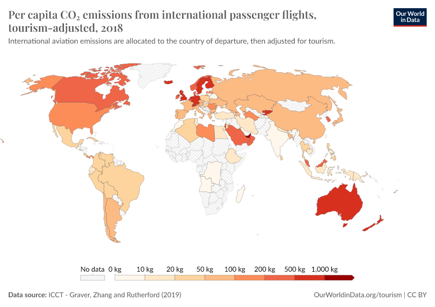
One way to correct for this is to adjust these figures for the ratio of inbound to outbound travelers. This approach was applied in an analysis by Sola Zheng for the International Council on Clean Transportation. This attempts to distinguish between locals traveling abroad and foreign visitors traveling to that country on the same flight.4 For example, if we calculated that Spain had 50% more incoming than outgoing travelers, we would reduce its per capita footprint from flying by 50%. If the UK had 75% more outgoing travelers than incoming, we’d increase its footprint by 75%.
We have replicated this approach and applied this adjustment to these figures by calculating the inbound:outbound tourist ratio based on flight departures and arrival data from the World Bank.
How does this affect per capita emissions from international flights? The adjusted figures are shown in the chart here.
As we would expect, countries which are tourist hotspots see the largest change. Portugal’s emissions, for example, fall from 388 to just 60 kilograms per person. Portuguese locals are responsible for much fewer travel emissions than outgoing tourists. Spanish emissions fall from 335 to 77 kilograms per person.
On the other hand, countries where the locals travel elsewhere see a large increase. In the UK, they almost double from 422 to 818 kilograms.
Per capita emissions from domestic and international flights
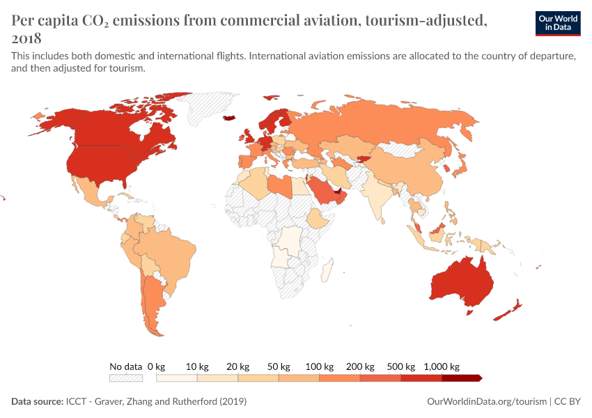
Let’s combine per capita emissions from domestic and international travel to compare the total footprint from flying.
This is shown in the interactive map [we’ve taken the adjusted international figures – we also visualize the combined figures without tourism adjustment].
The global average emissions from aviation were 103 kilograms. The inequality in emissions across the world becomes clear when this is broken down by country.
At the top of the table lies the United Arab Emirates – each person emits close to two tonnes – 1950 kg – of CO2 from flying each year. That’s 200 times the global average. This was followed by Singapore (1173 kilograms); Iceland (1070 kg); Finland (1000 kg); and Australia (878 kilograms).
To put this into perspective: a return flight (in economy class) from London to Dubai/United Arab Emirates would emit around one tonne of CO2.5 So the two-tonne average for the UAE is equivalent to around two return trips to London.
In many countries, most people do not fly at all. The average Indian emits just 18 kilograms from aviation – this is much, much less than even a short-haul flight which confirms that most did not take a flight.
In fact, we can compare just the aviation emissions for the top countries to the total carbon footprint of citizens elsewhere. The average UAE citizen emits 1950 kilograms of CO2 from flying. This is similar to the total CO2 footprint of the average Indian (including everything from electricity to road transport, heating, and industry). Or, to take a more extreme example, around 20 times the total footprint of the average Nigerien, Ugandan, or Ethiopian, which have per capita emissions of around 100 kilograms.
This again emphasizes the large difference between the global average and the individual emissions of people who fly. Aviation contributes a few percent of total CO2 emissions each year – this is not insignificant, but far from being the largest sector to tackle. Yet from the perspective of the individual, flying is often one of the largest chunks of our carbon footprint. The average rich person emits tonnes of CO2 from flying each year – this is equivalent to the total carbon footprint of tens or hundreds of people in many countries of the world.
Related charts:
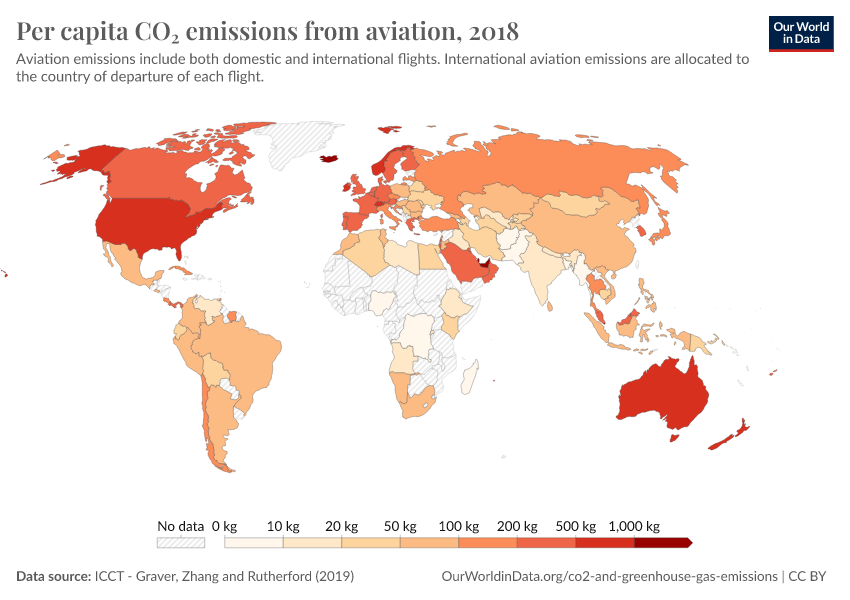
Per capita CO₂ emissions from aviation (without tourism adjustment)
See the data in our interactive visualization
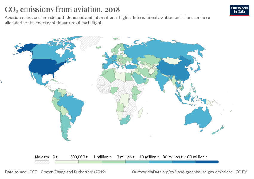
Total CO₂ emissions from aviation
See the data in our interactive visualization
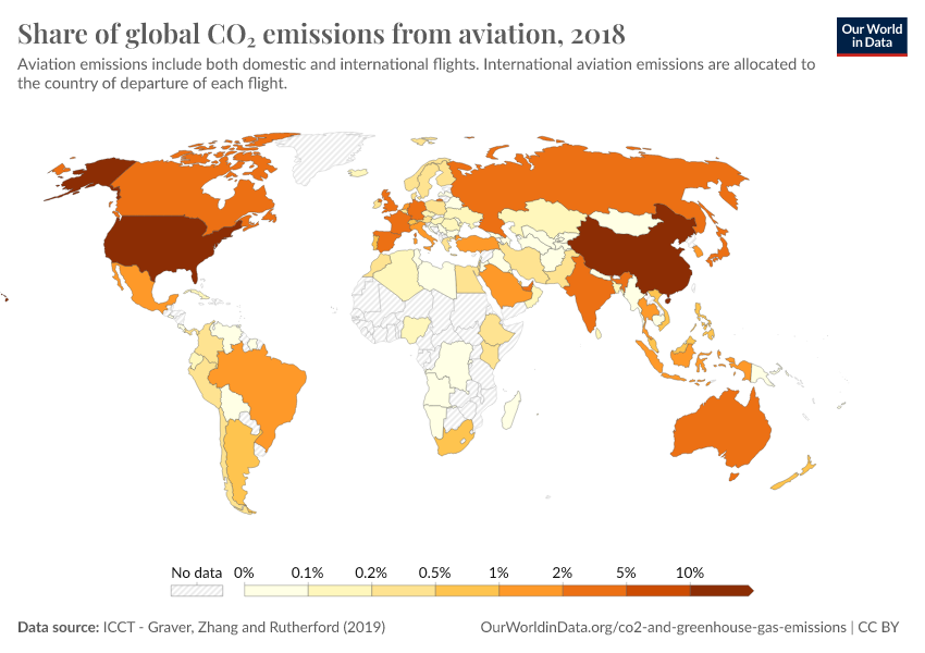
Share of global CO₂ emissions from aviation
See the data in our interactive visualization
Endnotes
There is no global database available on who in the world flies each year. Passenger information is maintained by private airlines. Therefore, deriving estimates of this exact percentage is challenging. The most-cited estimate I’ve seen on this is that around 80% of the world's population has never flown. This figure seems to circle back to a quoted estimate from the Boeing CEO.
Even in some of the world’s richest countries, a large share of the population does not fly frequently. Gallup survey data from the United States suggests that in 2015, half of the population did not take a flight. Survey data from the UK provides similar estimates: 46% had not flown in the previous year.
Graver, B., Zhang, K., & Rutherford, D. (2019). CO2 emissions from commercial aviation, 2018. The International Council of Clean Transportation.
Note that this gives us mean per capita emissions, which does not account for in-country inequalities in the number of flights people take.
Larsson, J., Kamb, A., Nässén, J., & Åkerman, J. (2018). Measuring greenhouse gas emissions from international air travel of a country’s residents methodological development and application for Sweden. Environmental Impact Assessment Review, 72, 137-144.
A country with a ratio greater than one will have more incoming travelers than outgoing locals i.e. they are more of a hotspot for tourism.
We can calculate this by taking the standard CO2 conversion factors for travel, used in the UK greenhouse gas accounting framework. For a long-haul flight in economy class, around 0.079 kilograms of CO2 are emitted per passenger-kilometer. This means that you would travel around 12,600 kilometers to emit one tonne [1,000,000 / 0.079 kg = 12,626 kilometers]. Since we’re taking a return flight, the travel distance would be half of that figure: around 6300 kilometers. The direct distance from London to Dubai is around 5,500 kilometers. Depending on the flight path, it’s likely to be slightly longer than this, and in the range of 5500 to 6500 kilometers.
Note that in this case, we’re looking at CO2 emissions without the extra warming effects of these emissions at high altitudes. This is to allow us to compare with the ICCT figures by country presented in this article. You find additional data on how the footprint of flying is impacted by non-CO2 warming effects here.
Cite this work
Our articles and data visualizations rely on work from many different people and organizations. When citing this article, please also cite the underlying data sources. This article can be cited as:
Hannah Ritchie (2020) - “Where in the world do people have the highest CO2 emissions from flying?” Published online at OurWorldinData.org. Retrieved from: 'https://ourworldindata.org/carbon-footprint-flying' [Online Resource]BibTeX citation
@article{owid-carbon-footprint-flying,
    author = {Hannah Ritchie},
    title = {Where in the world do people have the highest CO2 emissions from flying?},
    journal = {Our World in Data},
    year = {2020},
    note = {https://ourworldindata.org/carbon-footprint-flying}
}
Reuse this work freely
All visualizations, data, and code produced by Our World in Data are completely open access under the Creative Commons BY license. You have the permission to use, distribute, and reproduce these in any medium, provided the source and authors are credited.
The data produced by third parties and made available by Our World in Data is subject to the license terms from the original third-party authors. We will always indicate the original source of the data in our documentation, so you should always check the license of any such third-party data before use and redistribution.
All of our charts can be embedded in any site.
