Google Mobility Trends: How has the pandemic changed the movement of people around the world?
To tackle the Coronavirus pandemic, countries across the world have implemented a range of stringent policies, including stay-at-home 'lockdowns'; school and workplace closures; cancellation of events and public gatherings; and restrictions on public transport.
These measures were implemented to slow the spread of the virus by enforcing physical distance between people.
How effective have these policies been in reducing human movement? What impact has it had on how people across the world work; live; and where they visit?
We can get some insights on this from the data that Google presents in its COVID-19 Community Mobility Reports. Using anonymized data provided by apps such as Google Maps, the company has produced a regularly updated dataset that shows how peoples' movements have changed throughout the pandemic.1
This dataset from Google measures visitor numbers to specific categories of location (e.g. grocery stores; parks; train stations) every day and compares this change relative to baseline days before the pandemic outbreak. Baseline days represent a normal value for that day of the week and are given as the median value over the five‑week period from January 3rd to February 6th 2020. Measuring it relative to a normal value for that day of the week is helpful because people obviously often have different routines on weekends versus weekdays.
On Google's website the data is only visualized in pdfs – one for each country. We present Google's data in interactive charts below to make it easier to see changes over time in a given country; and how specific policies may have affected (or not) behavior across communities. Google notes that we should avoid comparing across regions or countries; this is because there may be local differences in categories which could be misleading.
We should also emphasise that change in visitors is measured relative to the baseline period between January and February 2020. This means changes in movement do not take account of seasonal variation – for example, we might expect visitors to parks or outdoor spaces to be higher during the summer. The data may therefore reflect some changes in seasonal movements, rather than being fully explained by changes due to the pandemic.
The amount of day-to-day variability in the raw data can make it difficult to understand how overall movements are changing over time. To make this easier to understand, we have converted the raw data into the seven-day rolling average. This is what is shown in the data in the following charts.
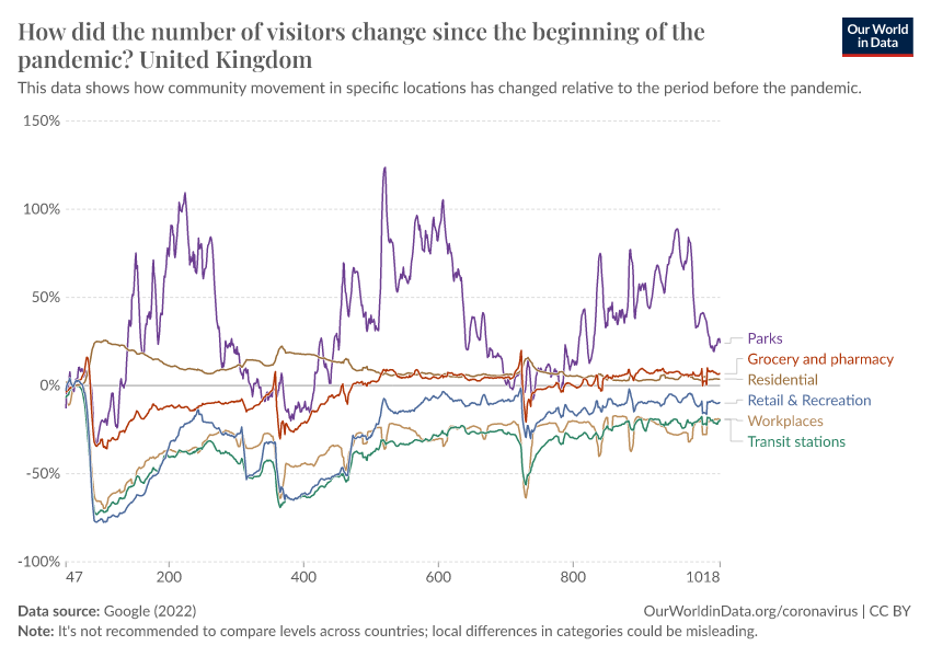
Change in visitors by category
This interactive chart shows how the number of visitors (or time spent) in categorized places has changed compared to baseline days (the median value for the 5‑week period from January 3 to February 6, 2020).
The ‘Residential’ category shows a change in duration of time spent at home—the other categories measure a change in total visitors.
This index is smoothed to the rolling 7-day average.
With the Change country option in the bottom left corner you can switch to another country.
To keep in mind when trying to understand these trends
Google provides clear guidance on how to read this data, and what should and shouldn't be inferred from it. Some key points:
- The Residential category is measured in different units (duration rather than visitors) so you shouldn’t compare this change with other categories.
- People already spend a lot of time at home, so changes in Residential are likely to be smaller.
- Visits to Parks and outdoor spaces are highly influenced by weather and holidays – we would expect larger spikes in this category.
- Gaps in a specific time series occur when the quantity of data is too low to meet data quality and anonymity standards – don't interpret this as zero change in visitors.
- Avoid comparing day-to-day changes. Especially weekends with weekdays.
- Avoid comparing levels across countries or regions. Regions can have local differences in the data which might mislead.
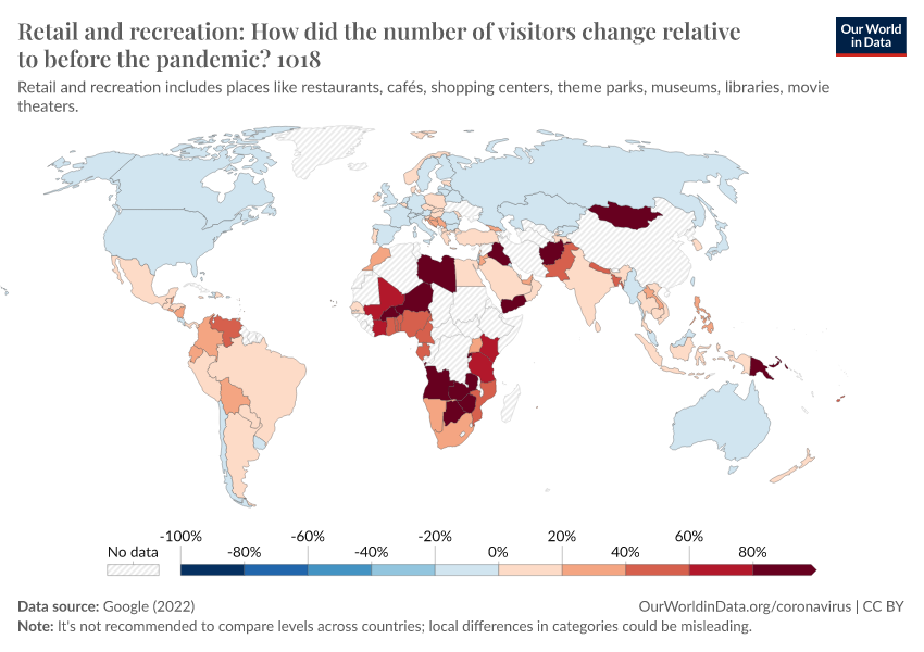
Retail and recreation
This interactive chart shows how the number of visitors to places of retail and recreation has changed compared to baseline days (the median value for the 5‑week period from January 3 to February 6, 2020).
This includes places like restaurants, cafes, shopping centers, theme parks, museums, libraries, and movie theaters.
This index is smoothed to the rolling 7-day average.
Three tips on how to interact with this map
- By clicking on any country on the map you see the change over time in this country.
- By moving the time slider (below the map) you can see how the global situation has changed over time.
- You can focus on a particular world region using the dropdown menu to the top-right of the map.
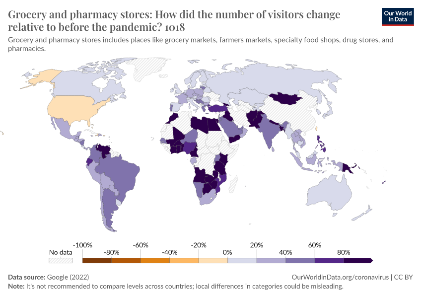
Grocery and pharmacy stores
This interactive chart shows how the number of visitors to grocery and pharmacy stores has changed compared to baseline days (the median value for the 5‑week period from January 3 to February 6, 2020).
This includes places like grocery markets, food warehouses, farmers markets, specialty food shops, drug stores, and pharmacies.
This index is smoothed to the rolling 7-day average.
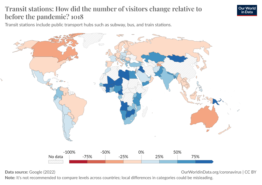
Public transport stations
This interactive chart shows how the number of visitors to transit stations has changed compared to baseline days (the median value for the 5‑week period from January 3 to February 6, 2020).
This includes public transport hubs such as subway, bus, and train stations.
This index is smoothed to the rolling 7-day average.
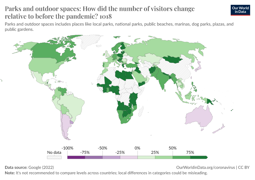
Parks and outdoor spaces
This interactive chart shows how the number of visitors to parks and outdoor spaces has changed compared to baseline days (the median value for the 5‑week period from January 3 to February 6, 2020).
This includes places like local parks, national parks, public beaches, marinas, dog parks, plazas, and public gardens.
This index is smoothed to the rolling 7-day average.
To keep in mind when interpreting this data
As Google notes in its guidance on understanding this dataset:
- In many regions, the data for Parks and outdoor spaces is spiky – this represents large day-to-day changes. This is because visitors to parks are heavily influenced by the weather and holidays.
- Since park visits are normally highly variable, you should expect more dramatic changes.
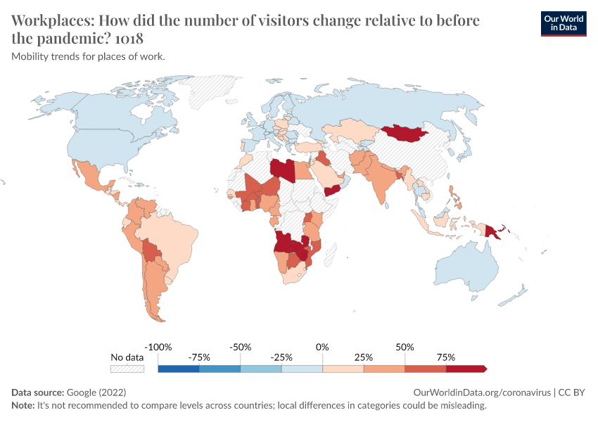
Workplace visitors
This interactive chart shows how the number of visitors to workplaces has changed compared to baseline days (the median value for the 5‑week period from January 3 to February 6, 2020).
This index is smoothed to the rolling 7-day average.
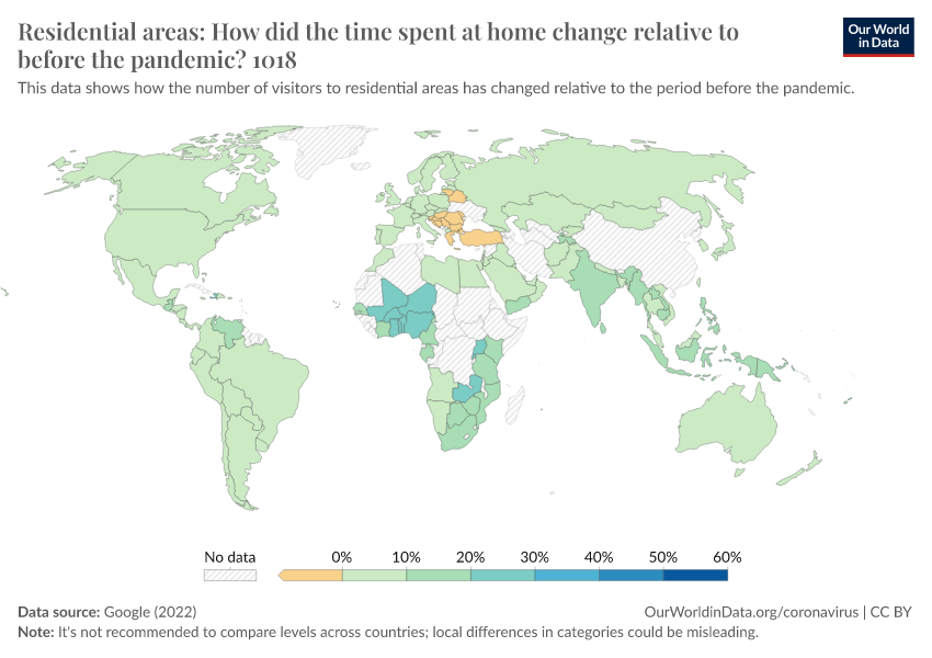
Time spent at home
This interactive chart shows how the number of visitors to residential areas has changed compared to baseline days (the median value for the 5‑week period from January 3 to February 6, 2020).
This index is smoothed to the rolling 7-day average.
To keep in mind when interpreting this data
As Google notes in its guidance on understanding this dataset:
- The Residential category shows a change in duration—the other categories measure a change in total visitors. You should therefore be careful in making comparisons to other categories.
- People already spend a lot of time at home (even on workdays), we'd generally expect smaller changes than in other categories.
What effect have these changes had on the spread of the pandemic?
Explore for yourself in our Coronavirus Data Explorer
How have the number of confirmed cases and deaths changed in each country over the course of the pandemic?
Endnotes
Note that Google emphasize: "The Community Mobility Reports were developed to be helpful while adhering to our stringent privacy protocols and protecting people’s privacy. No personally identifiable information, such as an individual’s location, contacts or movement, will be made available at any point.
Insights in these reports are created with aggregated, anonymized sets of data from users who have turned on the Location History setting, which is off by default."
Cite this work
Our articles and data visualizations rely on work from many different people and organizations. When citing this article, please also cite the underlying data sources. This article can be cited as:
Hannah Ritchie (2020) - “Google Mobility Trends: How has the pandemic changed the movement of people around the world?” Published online at OurWorldinData.org. Retrieved from: 'https://ourworldindata.org/covid-mobility-trends' [Online Resource]BibTeX citation
@article{owid-covid-mobility-trends,
    author = {Hannah Ritchie},
    title = {Google Mobility Trends: How has the pandemic changed the movement of people around the world?},
    journal = {Our World in Data},
    year = {2020},
    note = {https://ourworldindata.org/covid-mobility-trends}
}
Reuse this work freely
All visualizations, data, and code produced by Our World in Data are completely open access under the Creative Commons BY license. You have the permission to use, distribute, and reproduce these in any medium, provided the source and authors are credited.
The data produced by third parties and made available by Our World in Data is subject to the license terms from the original third-party authors. We will always indicate the original source of the data in our documentation, so you should always check the license of any such third-party data before use and redistribution.
All of our charts can be embedded in any site.
