How are extreme weather events and the climate evolving in the United States?
Explore century-long data on temperatures, precipitation, heatwaves, drought, and hurricanes in the United States.
We need to examine long-term data to understand how climate change is affecting weather extremes such as rainfall patterns, droughts, hurricanes, and heat waves.
Weather fluctuates a lot from year to year, so looking at changes over five or even ten years does not give us a particularly strong signal about whether these events are becoming more frequent or more intense. We need data over decades.
Unfortunately, many countries don’t have complete data that stretches so far back in time. One country that does is the United States.
The National Oceanic and Atmospheric Administration (NOAA) publishes data for many metrics going back to the 1850s. The Environment Protection Agency tracks and publishes these climate indicators.
On this page, you will find charts for many of the most important measures of change: hurricane frequency and intensity, temperature anomalies and heat waves, extreme rainfall patterns, and drought.
This data is updated annually, following the latest release from the US EPA.
Temperature
The most obvious and direct impact of recent climate change is rising temperatures.
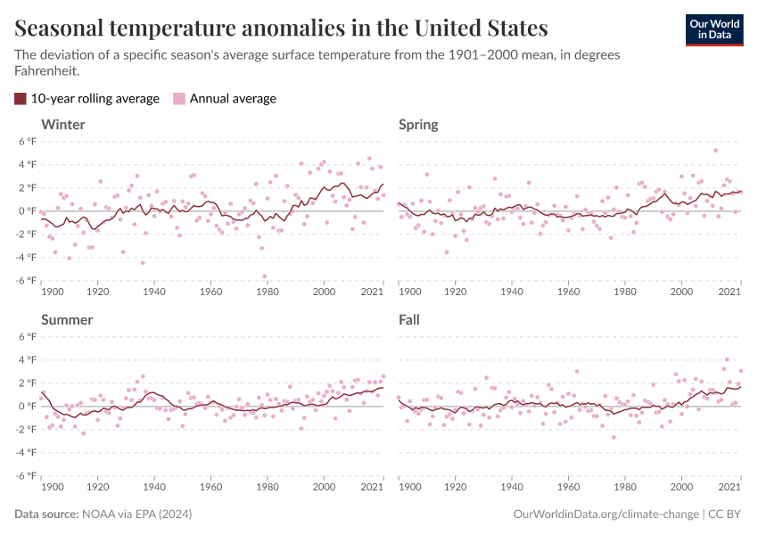
NOAA measures temperature anomalies in the US over time. A temperature anomaly tells us the difference between the recorded temperature and the historical average. In this case, the anomaly is measured relative to the average temperature over the 20th century (1901 to 2000). So if the anomaly in 2023 was 2°F, this means the temperature was 2°F warmer than the average in the 20th century.
In the chart below, you can see the anomaly in the US across different seasons. While temperatures vary a lot from year to year, you can see a clear warming trend across all seasons.
What’s interesting is that warming is not equal across the year. Minimum temperatures have increased faster than maximum temperatures. That means winter has warmed much faster than summer. And there has been a larger increase in nighttime temperatures compared to daytime.
This seasonal variation is important. More warming in winter greatly affects the amount of snow that falls, the water runoff from snowmelt, glacial melt, and the freezing of lakes. Spring has also warmed faster than summer, which can increase the length of the growing season. That’s why you can see earlier peaks in cherry blossoms in many parts of the world.
It’s not that US summers aren’t getting warmer — they are — it’s just that winters seem to be warming slightly faster. From the chart below, we can see that maximum summer temperatures are increasing. It shows the share of the US land that experiences “unusually high” summer temperatures in a given year.
“Unusually high” means it has maximum temperatures among the warmest 10% of years since the early 1900s. Over the last few decades, you can see a distinct rise in the share of US land that has recorded these temperatures. Note the “Dust Bowl” event in the 1930s, which also brought record summer temperatures to the US.
As we saw earlier, winters are getting much warmer.
The chart below shows the share of the US land with “unusually low” winter temperatures. Again, these are when minimum temperatures are among the coldest 10% since the early 1900s.
You can see a distinct downward trend. Although there is some annual variation, very few winters in the 21st century have seen record lows.
Finally, we can look at heat waves. Here, a heatwave is defined as a period lasting at least four days during which the average temperature is a level that would only be expected to occur once every 10 years based on the historical record. In other words, it is an extended period of very high temperatures that would be expected only once per decade.
The “Heat Wave Index” is an indicator that summarizes the frequency and extent of heat waves. The higher the score, the more often they occur, and the more widespread they are. This next chart shows the index's annual value since 1895.
The most striking feature is the extreme heat waves during the “Dust Bowl” event in the 1930s. This marked acute periods of extreme heat – at the far end of the temperature distribution. This was caused by poor land management and intense drought, which reduced levels of evaporation from soils.
The US EPA notes that the frequency of heatwaves and length of the season has increased since the 1960s.
Extreme rainfall
Because warm air tends to hold more water, climate change can also increase the frequency of heavy rainfall in some regions.
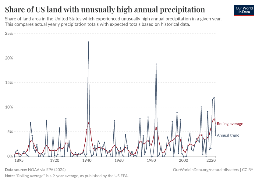
The chart below shows the share of US land that experiences “unusually high” precipitation. That means a given year saw more rainfall than expected based on historical data.
You can see that while there’s a lot of year-to-year variability, the rolling 9-year average has been rising since the early 2000s.
This can also be measured based on extreme one-day precipitation events. This is when a region experiences lots of rainfall on a single day.
The chart below shows the share of US land that experiences one of these extreme events each year. This typically goes through 5-to-10-year cycles, but it appears to have been rising slowly in recent decades.
Droughts
Another extreme weather event is drought. Warmer summers, particularly, can lead to extended periods of very dry conditions.
The chart below shows the “Palmer Drought Severity Index.” Positive values mean wetter conditions than average, while negative values mean drier conditions.
You can see large cycles of wetter and drier conditions. Again, the stand-out event was the “Dust Bowl” of the 1930s, an extended extreme drought that severely impacted agriculture.
Hurricanes
Hurricanes are tropical cyclones that originate in the Atlantic Ocean. They are some of the most destructive and deadly disaster events.
Hurricanes are measured using the Saffir-Simpson Hurricane Wind Scale. It categorizes hurricanes from 1 to 5 based on their maximum wind speeds. The higher the number, the more damaging it is. A “major hurricane” is one that is scored as a category 3 to 5 on the scale.
The NOAA maintains a record of historical hurricanes in its HURDAT database. The number of hurricanes in the North Atlantic and those making landfall in the US is shown in the chart below.
Data quality is an issue for long historical records. Some hurricanes — especially those that didn’t hit land — would have been missed before aircraft and satellite technology were available. Scientists have used other evidence, such as ship records, to improve these estimates, but some hurricanes may still be missing from early periods.
Hurricane activity tends to work cyclically, partly due to the natural climate patterns of El Niño and La Niña. Hurricane season tends to be more intense during La Niña years.
Overall, there is no clear upward or downward trend in the number of hurricanes hitting the US. This is also true for major hurricanes.
This is noted by the US EPA itself: “The total number of hurricanes (particularly after being adjusted for improvements in observation methods) and the number reaching the United States do not indicate a clear overall trend since 1878”.
And the NOAA: “There is no strong evidence of century-scale increasing trends in U.S. landfalling hurricanes or major hurricanes. Similarly, for Atlantic basin-wide hurricane frequency (after adjusting for changing observing capabilities over time), there is not strong evidence for an increase since the late 1800s in hurricanes, major hurricanes, or the proportion of hurricanes that reach major hurricane intensity.”
This does not mean that we won’t see increases in hurricane activity in the future as warming continues. But to date, there is no clear signal of an increase.
We can also look at hurricane landfalls in the US by category. Remember that “major hurricanes” are those in categories 3, 4, and 5.
Beyond the frequency of hurricanes, we can examine their intensity. This can be measured using the “accumulated cycle energy” (ACE) index, which combines the number, length, and intensity of hurricanes. Higher numbers mean more energy.
Again, there is very large variability from season to season — following the cyclical trend we mentioned above. The US EPA notes an increase in the ACE index since the 1990s, although this is compared to several decades of very low intensity during the 1970s and 1980s. Cyclone intensity may have increased, but it is hard to say conclusively, given improvements in measurement records over time.
From the US EPA: “Despite the apparent increases in tropical cyclone activity in recent years, [...] changes in observation methods over time make it difficult to know whether tropical storm activity has actually shown an increase over time.”
Cite this work
Our articles and data visualizations rely on work from many different people and organizations. When citing this article, please also cite the underlying data sources. This article can be cited as:
Hannah Ritchie (2024) - “How are extreme weather events and the climate evolving in the United States?” Published online at OurWorldinData.org. Retrieved from: 'https://ourworldindata.org/us-weather-climate' [Online Resource]BibTeX citation
@article{owid-us-weather-climate,
    author = {Hannah Ritchie},
    title = {How are extreme weather events and the climate evolving in the United States?},
    journal = {Our World in Data},
    year = {2024},
    note = {https://ourworldindata.org/us-weather-climate}
}
Reuse this work freely
All visualizations, data, and code produced by Our World in Data are completely open access under the Creative Commons BY license. You have the permission to use, distribute, and reproduce these in any medium, provided the source and authors are credited.
The data produced by third parties and made available by Our World in Data is subject to the license terms from the original third-party authors. We will always indicate the original source of the data in our documentation, so you should always check the license of any such third-party data before use and redistribution.
All of our charts can be embedded in any site.


