The world’s energy problem
The world faces two energy problems: most of our energy still produces greenhouse gas emissions, and hundreds of millions lack access to energy.
Summary
The world lacks safe, low-carbon, and cheap large-scale energy alternatives to fossil fuels. Until we scale up those alternatives the world will continue to face the two energy problems of today. The energy problem that receives most attention is the link between energy access and greenhouse gas emissions. But the world has another global energy problem that is just as big: hundreds of millions of people lack access to sufficient energy entirely, with terrible consequences to themselves and the environment.
The problem that dominates the public discussion on energy is climate change. A climate crisis endangers the natural environment around us, our wellbeing today and the wellbeing of those who come after us.
It is the production of energy that is responsible for 87% of global greenhouse gas emissions and as the chart below shows, people in the richest countries have the very highest emissions.
This chart here will guide us through the discussion of the world's energy problem. It shows the per capita CO2 emissions on the vertical axis against the average income in that country on the horizontal axis.
In countries where people have an average income between $15,000 and $20,000, per capita CO2 emissions are close to the global average (4.8 tonnes CO2 per year). In every country where people's average income is above $25,000 the average emissions per capita are higher than the global average.
The world’s CO2 emissions have been rising quickly and reached 36.6 billion tonnes in 2018. As long as we are emitting greenhouse gases their concentration in the atmosphere increases. To bring climate change to an end the concentration of greenhouse gases in the atmosphere needs to stabilize and to achieve this the world’s greenhouse gas emissions have to decline towards net-zero.
To bring emissions down towards net-zero will be one of the world’s biggest challenges in the years ahead. But the world’s energy problem is actually even larger than that, because the world has not one, but two energy problems.
The twin problems of global energy
The first energy problem: those that have low carbon emissions lack access to energy
The first global energy problem relates to the left-hand side of the scatter-plot above.
People in very poor countries have very low emissions. On average, people in the US emit more carbon dioxide in 4 days than people in poor countries – such as Ethiopia, Uganda, or Malawi – emit in an entire year.1
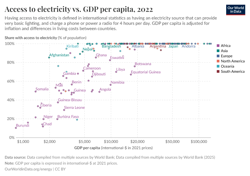
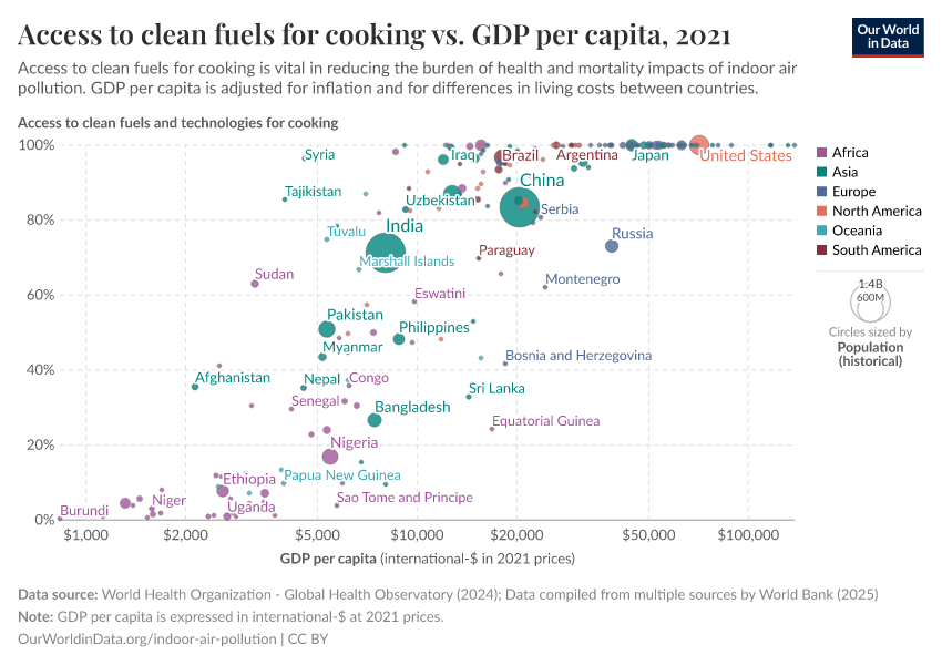
The reason that the emissions of the poor are low is that they lack access to modern energy and technology. The energy problem of the poorer half of the world is energy poverty. The two charts below show that large shares of people in countries with a GDP per capita of less than $25,000 do not have access to electricity and clean cooking fuels.2
The lack of access to these technologies causes some of the worst global problems of our time.
When people lack access to modern energy sources for cooking and heating, they rely on solid fuel sources – mostly firewood, but also dung and crop waste. This comes at a massive cost to the health of people in energy poverty: indoor air pollution, which the WHO calls "the world's largest single environmental health risk."3 For the poorest people in the world it is the largest risk factor for early death and global health research suggests that indoor air pollution is responsible for 1.6 million deaths each year, twice the death count of poor sanitation.4
The use of wood as a source of energy also has a negative impact on the environment around us. The reliance on fuelwood is the reason why poverty is linked to deforestation. The FAO reports that on the African continent the reliance on wood as fuel is the single most important driver of forest degradation.5 Across East, Central, and West Africa fuelwood provides more than half of the total energy.6
Lastly, the lack of access to energy subjects people to a life in poverty. No electricity means no refrigeration of food; no washing machine or dishwasher; and no light at night. You might have seen the photos of children sitting under a street lamp at night to do their homework.7
The first energy problem of the world is the problem of energy poverty – those that do not have sufficient access to modern energy sources suffer poor living conditions as a result.
The second energy problem: those that have access to energy produce greenhouse gas emissions that are too high
The second energy problem is the one that is more well known, and relates to the right hand-side of the scatterplot above: greenhouse gas emissions are too high.
Those that need to reduce emissions the most are the extremely rich. Diana Ivanova and Richard Wood (2020) have just shown that the richest 1% in the EU emit on average 43 tonnes of CO2 annually – 9-times as much as the global average of 4.8 tonnes.8
The focus on the rich, however, can give the impression that it is only the emissions of the extremely rich that are the problem. What isn’t made clear enough in the public debate is that for the world's energy supply to be sustainable the greenhouse gas emissions of the majority of the world population are currently too high. The problem is larger for the extremely rich, but it isn’t limited to them.
The Paris Agreement's goal is to keep the increase of the global average temperature to well below 2°C above pre-industrial levels and “to pursue efforts to limit the temperature increase to 1.5°C”.9
To achieve this goal emissions have to decline to net-zero within the coming decades.
Within richer countries, where few are suffering from energy poverty, even the emissions of the very poorest people are far higher. The paper by Ivanova and Wood shows that in countries like Germany, Ireland, and Greece more than 99% of households have per capita emissions of more than 2.4 tonnes per year.
The only countries that have emissions that are close to zero are those where the majority suffers from energy poverty.10 The countries that are closest are the very poorest countries in Africa: Malawi, Burundi, and the Democratic Republic of Congo.
But this comes at a large cost to themselves as this chart shows. In no poor country do people have living standards that are comparable to those of people in richer countries.
And since living conditions are better where GDP per capita is higher, it is also the case that CO2 emissions are higher where living conditions are better. Emissions are high where child mortality is the lowest, where children have good access to education, and where few of them suffer from hunger.
The reason for this is that as soon as people get access to energy from fossil fuels their emissions are too high to be sustainable over the long run (see here).
People need access to energy for a good life. But in a world where fossil fuels are the dominant source of energy, access to modern energy means that carbon emissions are too high.
The more accurate description of the second global energy problem is therefore: the majority of the world population – all those who are not very poor – have greenhouse gas emissions that are far too high to be sustainable over the long run.
The current alternatives are energy poverty or fossil-fuels and greenhouse gases
The chart here is a version of the scatter plot above and summarizes the two global energy problems: In purple are those that live in energy poverty, in blue those whose greenhouse gas emissions are too high if we want to avoid severe climate change.
So far I have looked at the global energy problem in a static way, but the world is changing of course.
For millennia all of our ancestors lived in the pink bubble: the reliance on wood meant they suffered from indoor air pollution; the necessity of acquiring fuelwood and agricultural land meant deforestation; and minimal technology meant that our ancestors lived in conditions of extreme poverty.
In the last two centuries more and more people have moved from the purple to the blue area in the chart. In many ways this is a very positive development. Economic growth and increased access to modern energy improved people's living conditions. In rich countries almost no one dies from indoor air pollution and living conditions are much better in many ways as we've seen above. It also meant that we made progress against the ecological downside of energy poverty: The link between poverty and the reliance on fuelwood is one of the key reasons why deforestation declines with economic growth.11 And progress in that direction has been fast: on any average day in the last decade 315,000 people in the world got access to electricity for the first time in their life.
But while living conditions improved, greenhouse gas emissions increased.
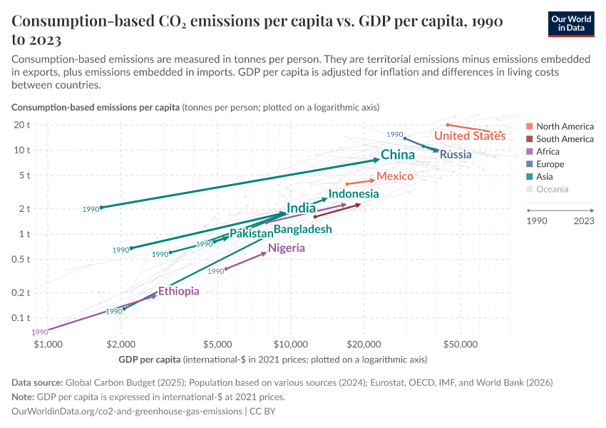
The chart shows what this meant for greenhouse gas emissions over the last generation. The chart is a version of the scatter plot above, but it shows the change over time – from 1990 to the latest available data.
The data is now also plotted on log-log scales which has the advantage that you can see the rates of change easily. On a logarithmic axis the steepness of the line corresponds to the rate of change. What the chart shows is that low- and middle-income countries increased their emissions at very similar rates.
By default the chart shows the change of income and emission for the 14 countries that are home to more than 100 million people, but you can add other countries to the chart.
What has been true in the past two decades will be true in the future. For the poorer three-quarters of the world income growth means catching up with the good living conditions of the richer world, but unless there are cheap alternatives to fossil fuels it also means catching up with the high emissions of the richer world.
Our challenge: find large-scale energy alternatives to fossil fuels that are affordable, safe and sustainable
The task for our generation is therefore twofold: since the majority of the world still lives in poor conditions, we have to continue to make progress in our fight against energy poverty. But success in this fight will only translate into good living conditions for today’s young generation when we can reduce greenhouse gas emissions at the same time.
Key to making progress on both of these fronts is the source of energy and its price. Those living in energy poverty cannot afford sufficient energy and those that left the worst poverty behind rely on fossil fuels to meet their energy needs.
Once we look at it this way it becomes clear that the twin energy problems are really the two sides of one big problem. We lack large-scale energy alternatives to fossil fuels that are cheap, safe, and sustainable.
This last version of the scatter plot shows what it would mean to have such energy sources at scale. It would allow the world to leave the unsustainable current alternatives behind and make the transition to the bottom right corner of the chart: the area marked with the green rectangle where emissions are net-zero and everyone has left energy poverty behind.
Without these technologies we are trapped in a world where we have only bad alternatives: Low-income countries that fail to meet the needs of the current generation; high-income countries that compromise the ability of future generations to meet their needs; and middle-income countries that fail on both counts.
Since we have not developed all the technologies that are required to make this transition possible large scale innovation is required for the world to make this transition. This is the case for most sectors that cause carbon emissions, in particular in the transport (shipping, aviation, road transport) and heating sectors, but also cement production and agriculture.
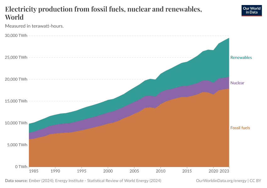
One sector where we have developed several alternatives to fossil fuels is electricity. Nuclear power and renewables emit far less carbon (and are much safer) than fossil fuels. Still, as the last chart shows, their share in global electricity production hasn't changed much: only increasing from 36% to 38% in the last three decades.
But it is possible to do better. Some countries have scaled up nuclear power and renewables and are doing much better than the global average. You can see this if you change the chart to show the data for France and Sweden – in France 92% of electricity comes from low carbon sources, in Sweden it is 99%. The consequence of countries doing better in this respect should be that they are closer to the sustainable energy world of the future. The scatter plot above shows that this is the case.
But for the global energy supply – especially outside the electricity sector – the world is still far away from a solution to the world's energy problem.
Every country is still very far away from providing clean, safe, and affordable energy at a massive scale and unless we make rapid progress in developing these technologies we will remain stuck in the two unsustainable alternatives of today: energy poverty or greenhouse gas emissions.
Endnotes
As can be seen from the chart, the ratio of emissions is 17.49t / 0.2t = 87.45. And 365 days/87.45=4.17 days
It is worth looking into the cutoffs for what it means – according to these international statistics – to have access to energy. The cutoffs are low.
See Raising Global Energy Ambitions: The 1,000 kWh Modern Energy Minimum and IEA (2020) – Defining energy access: 2020 methodology, IEA, Paris.
WHO (2014) – Frequently Asked Questions – Ambient and Household Air Pollution and Health. Update 2014
While it is certain that the death toll of indoor air pollution is high, there are widely differing estimates. At the higher end of the spectrum, the WHO estimates a death count of more than twice that. We discuss it in our entry on indoor air pollution.
The 2018 estimate for premature deaths due to poor sanitation is from the same analysis, the Global Burden of Disease study. See here.
FAO and UNEP. 2020. The State of the World’s Forests 2020. Forests, biodiversity and people. Rome. https://doi.org/10.4060/ca8642en
The same report also reports that an estimated 880 million people worldwide are collecting fuelwood or producing charcoal with it.
This is according to the IEA's World Energy Balances 2020. Here is a visualization of the data.
The second largest energy source across the three regions is oil and the third is gas.
The photo shows students study under the streetlights at Conakry airport in Guinea. It was taken by Rebecca Blackwell for the Associated Press.
It was published by the New York Times here.
The global average is 4.8 tonnes per capita. The richest 1% of individuals in the EU emit 43 tonnes per capita – according to Ivanova D, Wood R (2020). The unequal distribution of household carbon footprints in Europe and its link to sustainability. Global Sustainability 3, e18, 1–12. https://doi.org/10.1017/sus.2020.12
On Our World in Data my colleague Hannah Ritchie has looked into a related question and also found that the highest emissions are concentrated among a relatively small share of the global population: High-income countries are home to only 16% of the world population, yet they are responsible for almost half (46%) of the world’s emissions.
Article 2 of the Paris Agreement states the goal in section 1a: “Holding the increase in the global average temperature to well below 2 °C above pre-industrial levels and to pursue efforts to limit the temperature increase to 1.5 °C above pre-industrial levels, recognizing that this would significantly reduce the risks and impacts of climate change.”
It is an interesting question whether there are some subnational regions in richer countries where a larger group of people has extremely low emissions; it might possibly be the case in regions that rely on nuclear energy or renewables (likely hydro power) or where aforestation is happening rapidly.
Crespo Cuaresma, J., Danylo, O., Fritz, S. et al. Economic Development and Forest Cover: Evidence from Satellite Data. Sci Rep 7, 40678 (2017). https://doi.org/10.1038/srep40678
Bruce N, Rehfuess E, Mehta S, et al. Indoor Air Pollution. In: Jamison DT, Breman JG, Measham AR, et al., editors. Disease Control Priorities in Developing Countries. 2nd edition. Washington (DC): The International Bank for Reconstruction and Development / The World Bank; 2006. Chapter 42. Available from: https://www.ncbi.nlm.nih.gov/books/NBK11760/ Co-published by Oxford University Press, New York.
FAO and UNEP. 2020. The State of the World’s Forests 2020. Forests, biodiversity and people. Rome. https://doi.org/10.4060/ca8642en
Cite this work
Our articles and data visualizations rely on work from many different people and organizations. When citing this article, please also cite the underlying data sources. This article can be cited as:
Max Roser (2020) - “The world’s energy problem” Published online at OurWorldinData.org. Retrieved from: 'https://ourworldindata.org/worlds-energy-problem' [Online Resource]BibTeX citation
@article{owid-worlds-energy-problem,
    author = {Max Roser},
    title = {The world’s energy problem},
    journal = {Our World in Data},
    year = {2020},
    note = {https://ourworldindata.org/worlds-energy-problem}
}
Reuse this work freely
All visualizations, data, and code produced by Our World in Data are completely open access under the Creative Commons BY license. You have the permission to use, distribute, and reproduce these in any medium, provided the source and authors are credited.
The data produced by third parties and made available by Our World in Data is subject to the license terms from the original third-party authors. We will always indicate the original source of the data in our documentation, so you should always check the license of any such third-party data before use and redistribution.
All of our charts can be embedded in any site.


